Buried in my files is a photograph of several college friends proudly unveiling a new recycling station outside the campus library. The year is roughly 1989 and the campus is Humboldt State University in Northern California, where I first cut my teeth as a student recycling volunteer. The bin station was one of a dozen or so we built using plywood to encase 55-gallon drums. Each of the 4-foot tall stations was painted with a unique mural that reflected an environmental theme as well as our enthusiasm for the recently launched Campus Recycling Project. The stations were part of a network of mostly reused fiber and steel drums repurposed as a primitive recycling infrastructure.
Fast forward to a 2005 meeting with campus facilities officials. The friends in the photograph had long-since graduated and I was working as the university’s Solid Waste Reduction Manager. The by-then dilapidated wooden stations and rusting barrels had become emblematic of a condition that many large institutional recycling programs eventually face. Over the years, periodic grants and donations from other state agencies had allowed us to expand recycling across campus. The problem wasn’t just the funky condition of the bins. It was the overall network, a patch quilt of no fewer than 8 different styles made of various materials, colors and shapes, not to mention multiple generations of labels and signs. The question on the meeting agenda was what to replace them with.
Building the Recycling Brand
What I didn’t fully understand then, and what the recycling industry has generally been slow to appreciate is that inconsistency is about more than aesthetics. It’s a significant impediment to recycling behavior. Contamination and low recycling participation comes down, in part, to a weak association of the recycling brand. Look to soft drinks as a parallel. Coca-Cola uses a very precise shade of red and old-timey font on all their bottles. Not some of their bottles, ALL of their bottles. And just as importantly, they threaten to sue anyone else who tries to mimic that same look. That’s because a loyal customer opening the cooler in a mini-mart isn’t necessarily stopping to read the words “Coke” or “Coca-Cola”, they’re simply grabbing the bottle whose general look matches their association. When it’s time to toss that bottle, they’re likely to dedicate a similarly fleeting level of attention to reading the words on a bin label. If the recycling bin looks distinctly different from the trash and matches their color association for recycling, they’re more likely to reach toward it. If the bins look indistinguishable with a casual glance, that otherwise loyal Coca-Cola customer is just as likely to toss the bottle in the trash. In other words, the bin-equivalent of buying a… Pepsi. The marketing folks in Atlanta shudder at the thought.
Recycling behavior is complex. At the risk of oversimplifying, it largely boils down to removing two fundamental barriers. The natural tendency of many university, corporate campuses or even local parks & rec departments is to focus on the first of these, lack of convenience. Like Humboldt State, the main objective is simply to get recycling bins out for people to use. Maybe they skip the wooden cabinets hand painted with trees and rainbows. But without guardrails in place, the whims of procurement rules, decentralized decision making, and a bosses’ personal design preferences all too often lead to purchasing bins without regard to what’s already in place or what might come in the future. A decade passes and you find yourself with layers of infrastructure that, like tree rings, can be used to date the evolution of the recycling program. It’s confusing enough for the average person that recycling bins change color and have different sorting requirements as they travel from home to work, down the street or wherever else they go. As facility managers, we can’t control the inconsistencies of the recycling industry at large. But we can bring a measure of sanity by making recycling consistent with the infrastructure we do control. We do this by creating design standards and protocols to guide future bin purchasing, signage and placement throughout our facility(ies).
What to Specify With Bin Standards
Standardized guidelines will obviously reflect the unique situations of each organization or facility type. Generally speaking, however, their level of detail and formality should correspond to the organization’s size and degree of decentralized decision-making. At their most basic, standards should define the following key items:
-
Waste streams & bin configuration
The goal is to maintain the exact same arrangement of collection streams and bins in all general, high-volume public locations. Each location should reference the same defined list of acceptable materials. Of course, there are exceptions to every rule: You don’t need a 4-stream station for settings that generate very specific types of material (e.g copier rooms, next to a shredder, work out room, etc.). Space constraints and other real world conditions may force compromises, but your compass should always aim toward reinforcing people’s expectations wherever they go.
-
Colors for each collection stream
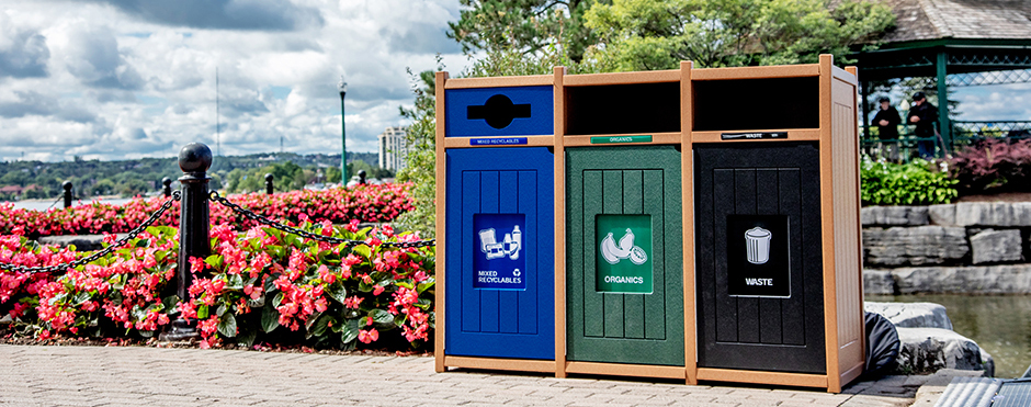
I’ll get into the weeds with a future blog about the best colors to use and other best practice features. (spoiler: blue = recycling; green = organics). The point I’ll make here is that color is probably the single strongest feature people use to distinguish one stream from another. Allowing colors to be used interchangeably from one location to the next invites disaster.
-
Styles and appearance
The goal here is to designate a small handful of bin styles to meet the broad aesthetic and operational needs of different locations. For a typical university or corporate campus, you need a nice high-end looking indoor bin for the executive suites and high-profile locations like a main entrance or performing arts venue. If you have the budget, go crazy using this style in all public spaces. If you don’t, select a second work-a-day style bin to distribute throughout the hallways, lobby areas, break rooms and other centralized locations. Perhaps a third indoor style is warranted. Outdoor areas can probably be covered with one style, but perhaps a second can save costs with out of the way locations. A third bin category to consider is a lightweight, easy to store and transport bin for events.
-
Bin features
This is where you get into critical details that determine the bin’s functionality, or equally possible, dysfunctionality. I’m not going to dive into the detailed list of features to consider here. These are varied and important enough to deserve separate blogs by themselves. But we can generally break these features into three categories to address: 1) behavior – to influence sorting decision (size of shape of restrictive openings, positioning and size of labels / signage, etc.); 2) operational efficiency (capacity, minimize need for cleaning, ease of servicing, avoiding leakage, etc.); and 3) health and safety (compliance with fire codes, ergonomics, etc.). Decide what the critically important features are to your situation and define these with enough specificity to avoid ambiguity with uninitiated personnel that guide future purchases.
-
Placement
You guessed it. Where to place bins is also very important and will also be covered in a future blog. Not to sound dramatic, but the placement of bins can be a life or death decision (Keeping those hallways clear during a fire is pretty important). The consequences are fewer, but placement of bins, down to even a few inches, can have an equally significant impact on recycling behavior. At a minimum, guidelines should designate general location information (e.g. within XX ft walk from of workstations; clearly viewable from multiple directions, etc.) as well as their relationship to other bins and spacial features (trash and recycling placed immediately next to each other; not intrude on minimum XX inch / centimeter clearance for egress pathways, etc.).
-
Labels & Signage
This is another critical area where design can determine either acceptably clean or horribly contaminated collection streams. Most bin manufacturers provide off the shelf labels or signage to go with their bins. These may work fine in certain settings. But where bins are exposed to significant public usage (outside of relatively controlled, locations with a stable population such as office workspaces) like building lobbies, food courts, airports, venues, or above all outdoor streetscapes or parks, you should give serious consideration to creating your own customized versions. This both allows specific messaging that reflects the nuances of your waste stream and ensure they incorporate best practices (images, precise verbiage, etc.). Pro-tip: For decentralized institutions where many people may control the actual purchase and set up of bin station, have the approved labels and signage graphics available for anyone to download and use. More blogging to come on this topic too.
…Pause For a Word From Our Sponsor
I’m careful to keep a firewall between product marketing and the practices I cover in this blog series. That said, loyalty compels me to point out that Busch Systems has a deep catalog of many fine recycling and waste containers that employ industry best practices. Simply click on the “Products” tab at the top of your browser to learn for yourself. If you decide to reach out to a sales rep, be sure to tell them I sent you. I don’t get a commission but it could influence the kind of Secret Santa gift I receive at the end-of-the-year office party!
Implementing Standardized Guidelines
In a 2017 survey I organized with the College & University Recycling Coalition (CURC), an impressive 78% of the 300+ recycling managers that responded said they had or were developing bin standards. Of this number, however, 30% indicated their guidelines were simply informal recommendations that campus stakeholders were “encouraged but not required” to follow. There’s a big difference between an “encouraged” standard and one that carries the full weight of institutional policy. Something that is “encouraged” is something that can be ignored. Voluntary guidelines may influence purchasing to a degree. But they come with a risk that individual decision maker’s own priorities will overrule them. Even where the person in charge of waste and recycling planning has direct control over bins purchases, informal standards can be as ephemeral as the piece of paper they’re printed on when departing staff purge old files.
Guidelines become more resilient when they’re sanctioned with the stamp of institutional authority. It can be a slow, painful process, but to the extent possible, I strongly advocate going through a formal process to designate official standards that are a requirement to follow. Whether that process requires it or not, you should make a point to engage stakeholders at the outset. These might include architects, capital projects managers, campus planners, building managers, custodial and grounds managers or the corresponding personnel at auxiliary or satellite facilities. This is often where the “painful” part kicks in. They’ll have opinions and can even risk hijacking the priorities that determine the standards. But the reality is these folks have opinions regardless and resolving them up front will make the final standards more resilient to interference in the long term.
The key is to get ahead of the process, doing your homework before serious discussions begin. Some of the ways to prepare:
- Gather evidence from waste audits or hauler feedback about contamination / low participation issues, along with the cost or staffing implications to deal with them.
- Bring best practices or comparable case studies that show how your specs can address these issues.
- Consult nearby jurisdictions for existing color or other standards to harmonize with. Note that a small but increasing number of state and local governments, including the state of California, are implementing uniform color or labeling requirements your organizations may be subject to.
- Study the operational features to understand how they can help or hinder the collection process. Many bin manufacturers are willing to send a sample, even of higher end models, if they know it could lead to a long-term sales relationship. Test four or five candidates in the field for a month. Ask collection workers, custodians or grounds crew to give critical feedback on what they like or don’t about each.
- Consider whether there are different manufacturers selling sufficiently similar version of the same style, or whether a standard could leave you dependent on a single supplier.
- Think strategically about how your waste recovery program is likely to evolve in the coming years. You may not be collecting food organics now, but could they be in the 5 or 10 year plan? Green is the dominant color standard for organics, so avoid assigning it to a different stream in the interim. Contamination and market turmoil have forced some programs to revert from single stream recycling back to two or more recycling collections streams. The future may not be obvious where you’re sitting, so it’s worth talking to your hauler or solid waste district to gauge how much flexibility your standards need accommodate. If there’s a possibility of adding or subtracting collection streams in the near future, you might prioritize modular design over a cabinet station that can’t be altered.
- A stakeholder process involves give and take. As with any negotiations, go into the conversation with an understanding of which features are essential and which ones you can live without.
Don’t Sacrifice “Function” on the Alter of “Form”
Having won a sizeable grant to replace the older bins, I walked into that 2005 meeting with the campus planning director, head architect and building service managers to decide on the new bin design. The dominant building on campus was built in a mission revival style, and the director felt the new bins were an ideal opportunity to establish this as a new design theme for all site furnishings on campus. He produced a catalog and pointed to photos of an undersized, pinkish mission-style concrete bin. This was his front runner for both trash and recycling. I registered my concern about the lack of best practice features, but the truth is I wasn’t prepared and didn’t make the point forcefully enough to change the outcome. My comments where acknowledged, the decision formalized and the meeting moved on to the next agenda item.
I can’t undo that decision, but like a message from beyond the grave, I beseech thee to heed my warning! For someone outside of the recycling field, it’s natural to think of recycling in straightforward terms. People toss items in the bin and you empty it. With that simplistic understanding, the deciding factor becomes what will look nice. It’s critical that decision makers understand that the physical appearance of bins – the colors, restrictive lids and other features that distinguish the different streams from each other, are integral to their functionality. There are plenty of well designed and attractive bins, but it requires some flexibility and research to find the right ones. But simply ignoring these best practices in favor of aesthetic preferences risks investing thousands if not tens or hundreds of thousands of dollars into an infrastructure that fails to do what it’s intended to do: collect recyclable items separate from non-recyclable items. Facility planners wouldn’t construct a building with an electrical system that fails to turn on lights. They wouldn’t knowingly install plumbing that lacks water pressure. You may not win the argument, but as a recycling planner facing this situation, it’s your job to forcefully make the point that best practice features aren’t “preferable” or an “opinion” to be considered. They’re essential.
Examples of Bin Standard Guidelines
- University of Michigan
- Dalhousie University
- University of California, Los Angeles
- UNC Chapel Hill
- University of British Columbia
- University of Washington
