Avoiding common mistakes that can doom public-facing recycling programs.
I used to give away recycling bins for a living. For eleven years I managed grant programs for Keep America Beautiful and the National Recycling Coalition distributing bins to help local communities kickstart recycling in parks and other recreation areas. Like any grant program, my overriding criteria was to select recipients that would result in the greatest impact. Where could a strategic investment put the bins to the best use, accelerating local recycling efforts and recovering lots of material from the waste stream? The moment of truth would come a year later when recipients submitted their post-implementation reports. With professional pride at stake, I reviewed these hoping to learn I’d picked the right communities. Mixed among the positive reports with photos of mayors cutting ribbons, there were inevitably the duds. These reports often included frustrated comments about heavy contamination and “people just not willing to recycle”. Then I’d scroll down to the pictures showing where they’d placed the bins. And funny thing, there’d be no trash bin in sight.
Recycling: Not That Simple, and Yet Not That Complicated
It wasn’t that they hadn’t been warned. Grant recipients were provided best-practices resources and a grant agreement that explicitly required the bins to be paired with trash. The problem was a combination of issues. Parks & rec planners are juggling many considerations – tight budgets, space limitations, operational considerations, etc. The other issue, though, is that many simply didn’t appreciate that something as simple as the placement of bins could make such a difference. For anyone who hasn’t managed a recycling program in the past, it’s easy to fall into the trap of assuming recycling is a straightforward operation. You put bins out, people fill them up and then you empty them. No problem!
Recycling is not straightforward. Even the most successful programs experience some degree of people tossing trash in the recycling and vice versa. It’s not that they’re unwilling to recycle – there’s plenty of research showing most people are. But you have to consider certain realities about human behavior. The impulse to recycle still must contend with 70 years of conditioning under a consumer culture that encourages us to simply “throw things away”. By definition, a waste item holds no value to the person getting ready to toss it. Something of little value warrants less of your attention. That fundamental dynamic plays out in several ways. It means people are not likely to walk further out of their way than they have to. It means that as they approach bins they’re not likely to concentrate close attention on them. And that lack of concentration means that any ambiguity about how to sort an item has to be resolved in a split second – or they’ll simply use the first bin opening they come to. In a public space setting like a park, you can’t force people to be more thoughtful. But you can design your recycling program to anticipate this dynamic, using best practices that intuitively guide people to sort items more carefully. These boil down to 5 basic rules of thumb:
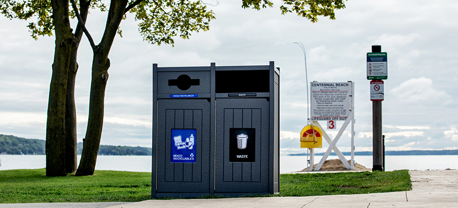
- Twin the bin – Put recycling bins directly next to trash bin. Not 3 feet away. Not on the other side of a bench or flower bed. Directly next to the trash. Even a few feet of separation allows people to default for the first bin the approach, without having to make an effort. By placing trash and recycling together, you make them equally convenient, which in turn forces them to actually make a choice. A 2018 Keep America Beautiful study of park and downtown recycling programs found that contamination was 15% lower and the recycling capture rate 30% higher in locations where trash and recycling were paired.
- Follow design best practices – We can get pretty granular talking about bin design, so let’s save them for a dedicated blog in the future. For the moment let’s touch on the two biggies that influence behavior:
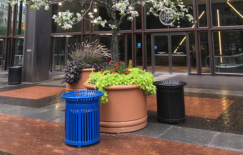
Many people will toss their waste in the recycling bin rather than walk around the planter to the trash bin.
-
- Make the bins visually distinct. While you want them to match each other for aesthetic reasons, using identical-looking bins for recycling and trash has a strong likelihood to generate heavy contamination. There are two levels of information that bins have to communicate to the person approaching them. Hopefully, they’ll look at the label or signage to learn what materials are recyclable. The other message bins must convey is simply that they are different from each other – that there is in fact a choice to be made. The way to do this and maintain aesthetic harmony is to select the same style of bin for both trash and recycling, but use separate colors or physical features such as special dome lids to distinguish them. Think of the color as a form of branding for each collection stream. I strongly recommend going with the dominant standard across the US and Canada, which is blue for recycling, green for food organics, and black for trash. And don’t just rely on a thin strip or patch of the color to do the job. The more prominent these colors are, covering much if not all of the bins, the stronger they communicate the brand and guide people to use the correct one.
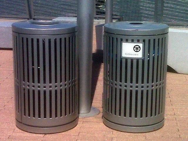
Identical trash and recycling bins are likely to be treated interchangeably regardless of the label.
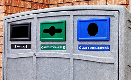
- Use restrictive lids. Smaller, constricted openings force people to focus more of their attention. The more attention they give, the more likely they are to choose the right bin. Additionally, research by a George Washington University suggests the shape of a restricted opening (round for cans and bottles; thin slot for paper) can trigger an association with recycling, adding another visual prompt that distinguishes the bins. The opening for trash should be larger so that it functions as the default catch-all for those who truly don’t care. BTW – here’s a pro-tip: beware of rubber baffles or entirely closed lids that require pulling a handle. You don’t need academic research to understand the aversion most people have to touching a public waste bin.
-
- Placement matters – There’s a famous anecdote about how Disney spaces trash bins exactly 27 feet apart (or 30 depending on the source) as the optimal distance to avoid people tossing items on the ground. You may also have heard examples of national parks and other locations getting rid of trash bins as a strategy to reduce litter. So which is it? Do you need lots of bins, just a few or none at all? If recycling behavior is complex, litter behavior is even more so. I won’t go down the rabbit hole, but those who wish to can start with Keep America Beautiful’s 2009 study of litter behavior. What I will say is that litter has a lot to do with the context of the location, including what people perceive to be the social norm. In my experience, there’s no easy formula that replaces the boots-on-the-ground work of studying and responding to the usage patterns of a given facility. Is there a food concession or picnic area? Put bins there. Filling up too fast? Add more. Put bins outside of restrooms. But do you need bins in the middle of a field? Or placed every 25 feet along a footpath? Your experience may be different, but in many cases, not. Do waste audits, keep track of how fast bins fill up, conduct a litter index, study the flow of foot traffic. Above all, experiment moving bins around to test what works and what doesn’t.My gut-level opinion is that many parks go overkill assuming they need trash bins scattered everywhere to avoid litter. There’s no question some locations do need this, but not all or even most. The problem is, good outdoor bins are expensive. More bins require more staff time to empty. These costs, in turn, become a barrier to recycling. It either requires a significant investment to match and maintain recycling bins next to every trash or a frequent alternative, setting out a handful and hoping people will walk past three trash bins to find them. We covered this already. They won’t. Instead, the economical way to put recycling on equal footing, in many cases, is to remove redundant trash bins altogether.
- Use effective labels and signage – What to put on bin labels comes down to art as much as science. Start with the science. I can point to multiple academic studies indicating photos and icons generally work better than words alone. Using both side-by-side does even better. Just as important is to make them as large and prominent as possible. I can cite other studies showing that signage placed above the bin, closer to eye level can improve sorting by 20%. Knowing that most people aren’t focusing their attention closely, avoid presenting too much detail that risks having them tune out the information all together. Reference two, three, or at most four items, using simple, terminology that broadly encompasses the items you want while excluding the items you don’t. Which isn’t so easy. That’s where the “art” side of things kicks in.The items to list partially depend on the nuances of each location. Unless you’re finding an abnormally high-volume of relatively clean paper, I wouldn’t bother trying to collect it in a park or other outdoor public space. There’s a lot of room for confusion about recyclability, and paper tends to get cross-contaminated with liquids in this setting. Leaving it out also reduces the number of items to list. “Cans” is good to use, because it succinctly conveys a range of aluminum and steel containers that are recyclable, while avoiding any common non-recyclable items. Plastics, of course, are another matter. To simply say “plastics” invites all manner of food wrappers, bags, polystyrene and other non-recyclable items. You’re generally trying to recover plastic drink bottles in a park location, but only referencing “Bottles” opens you up to glass. Which may be fine or not. Plus you may have a program that accepts plastic food containers. And then there’s the question of only taking certain types of plastic bottles (the old #1 PET, #2 HDPE, etc. codes). Frustrated yet? My default would be to go with “plastic bottles or “plastic containers” in most situations. If you have a significant contamination problem, the next step is to do a waste audit to better understand exactly where the source of confusion lies, and how to message for it.
Last bit of advice on signage: avoid industry jargon. Regular folks have no idea what “single-stream” is, and conversely, everyone has their own interpretation of what “mixed recycling” means. You should also avoid listing the “no” items. This might be appropriate in an office or residential setting where people are likely to absorb the information over time. But in a public space location, it simply adds too much detail. The exception might be if a waste audit flags a particularly chronic contaminant like coffee cups or doggie poop bags. In that case, I’d just go with a graphic of the item with a red strike-through.
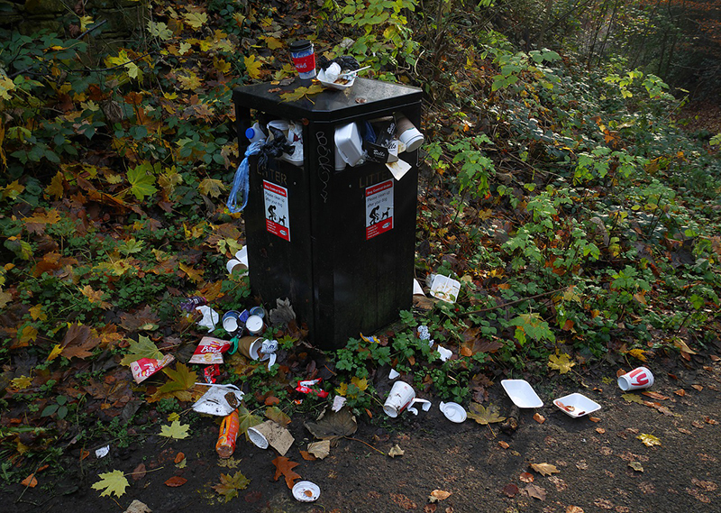
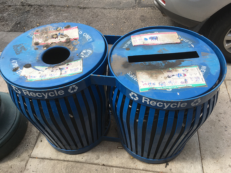
- Keep the bins clean and well maintained – This may be a priority already, but have a system for regular cleaning and maintenance. Besides looking funky, my experience is that grimy recycling bins with gum or cigarette scars negatively impact sorting behavior. I can’t point to a specific study, but my armchair-psychologist-take is that it undermines people’s emotional reaction to the bin. Trash is perceived as “dirty”. It’s a vaguely undesirable thing, whereas recycling is perceived as virtuous and “good”. That’s not a rational or even conscious reason that someone wouldn’t recycle, but I think we’ve established by now that recycling behavior often isn’t governed by rational thought.
Grimy, poorly-maintained bins are more likely to attract contamination.
Replacing worn-out labels should be straightforward. People can’t follow what they can’t read.
Don’t Surrender Function for Form
Here’s a “secret bonus track” piece of advice: Take these tips seriously. If you Google “best practices public spaces recycling” you’ll find any number of blogs and guides that cover the same basic points I have. What distinguishes this one is that you get a bit of my soapbox moralism tossed in. Operational and other considerations do sometimes require compromise. Fair enough. However, all too often these best practices are treated as preferences or secondary considerations. Exhibit A: administrators and architects like attractive-looking bins. (Full disclosure, I like them as well.) The good news is that with patience and some flexibility it’s possible to find nice-looking bins that also check the box on best practices. But to a point I’ve made in other blogs, simply defaulting to aesthetics as the overriding priority risks investing thousands if not tens of thousands of dollars in a faulty infrastructure that fails to accomplish its purpose: collect recyclables separate from non-recyclables. You wouldn’t select trees to plant-based on aesthetics if you know they’ll die with the changing seasons. You wouldn’t knowingly install playground equipment prone to cause injuries, simply because it matches the site furniture. In the eternal struggle between form and function, it’s critical to understand that with bins, form is an integral aspect of the function. Ignore this at your own peril.
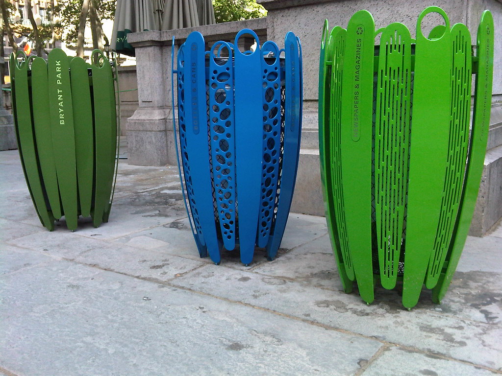
Nice looking bins, but which one is for trash?
Additional Resources
For a more in-depth look at public space recycling, you can find a best practice guide I wrote a few years back for Keep America Beautiful.
The Ontario Continuous Improvement Fund also has a public space recycling guide and other tools worth checking out.
